The start of the 2019 academic year marks the launch of a new identity for Arts et Métiers. The school's organization has been consolidated to make it more transparent and efficient, both internally and externally, through three main areas of focus:
- Becoming a leading technology institution
- Being a magnet for the technology sector
- Being a player in land use planning
Accelerator of talent, facilitator of technical processes and developments, innovator of skills: this is the momentum behind the new identity of Arts et Métiers.
The foundations of Arts et Métiers identity Arts et Métiers on understanding industrial needs in order to provide solutions to companies in terms of both training and research. Arts et Métiers in the French higher education and research landscape as a socio-economic player serving local communities and businesses.
Check out the official video for the launch ofArts et Métiers new identityArts et Métiers
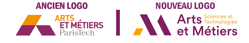
A new designation
Creation of an Arts et Métiers group
The new brand represents the Arts et Métiers group, Arts et Métiers of the public institution, its commercialization subsidiary AMVALOR, and its sponsorship fund FDIF (Fonds développement industrie du futur).
The term "science and technology"
The words "science and technology" in French were added to better clarify the school's areas of activity.
An English version
The decision to add the words " Institute of Technology " for international purposes allows the Arts et Métiers group to position itself Arts et Métiers the leading technology universities.
A new design
The design is more streamlined, and the overall graphics are more spacious. Arts et Métiers new heights while remaining true to its roots (its historical heritage and memory). The logo is now more modern and references innovative, pioneering, and creative engineers.
The pictogram
The slanted lines in the pictogram on the left are higher. They create a movement that energizes the image and make an aesthetic but obvious reference to the letters "A" and "M," which are the first letters of the name Arts et Métiers. The interlocking graphic shapes evoke industrial design, giving a more fluid appearance where the shapes flow.
The ternary rhythm of the logo
A ternary rhythm is established throughout the logo: three slanted lines form the monogram, and each text element contains three words (Arts et Métiers Sciences et Technologies). Together, these elements form a triad. This ternary rhythm creates harmony throughout the composition.
Textual elements
In this logo, the immediately recognizable textual element is the name " ARTS ET MÉTIERS " It serves as the reference point for the visual architecture. Whereas it was offset in the old logo, "Arts et Métiers is now aligned to the left, creating greater balance. The font used is " Circular Std " is powerful, airy, and timeless, lending stability that reflects the institution's solidity.
Colors
The combination of warm colors remains close to the old logo, but more depth and density have been added with the choice of new graphic Pantone colors. These two colors are rarely used in higher education graphics. With this choice, Arts et Métiers its distinction and originality.
The elements of power mentioned above are particularly highlighted by the dual tones of plum and orange, which bring out dynamism, density, and intensity.